QVest Q2 2022
Fractional Share Investment App MVP

I was the only product designer leading this project in Q2 2022 building a design system, ideating early concepts, running design sprints, presenting regularly to leadership, and delivering final assets. I worked with a team of a fintech start-up that included a project manager, a product manager, and two engineers.
The goal of the project was to design a new fractional share investment application that meets the following requirements:
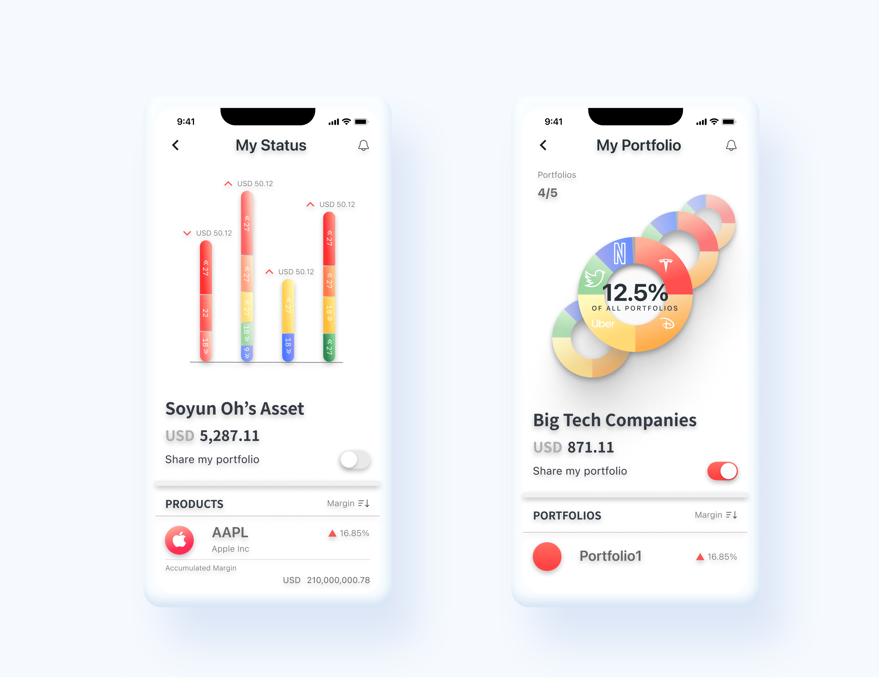
• Inform the portfolio status by intuitively presenting the proportion of each fractional share
• Utilize the buy/sell function
• Create a new and fun UX, distinguishable from the conventional finance/investment apps
To summarize, the challenges were related to limited resources in many ways.
I worked on this project for two months part-time, four hours a day.
As the team was a start-up, I had to do all processes of design work from scratch in a limited timeline.
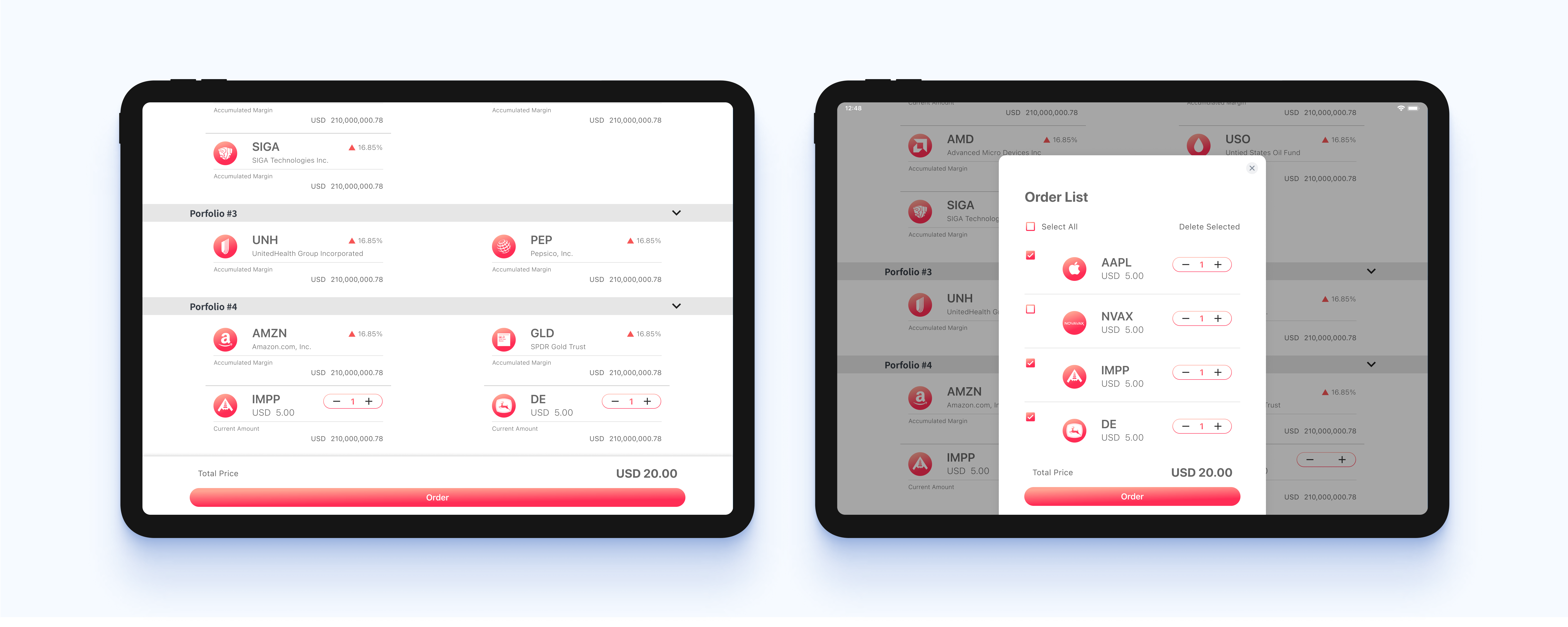
I was asked to realize the app focusing on the major function, which was buying and selling the shared stock, within two pages. This required very neat, concise, but powerful architecture that contains multiple functions in a tight space available.
One of the project goals, 'creating a new and fun UX' was challenging and I had to come up with a creative solution. While typical design work will start from searching for references in the industry, it was hard to find one as I had to design a UX distinguishable from the conventional investment apps.
To create an intriguing and non-typical investment UX, I referred to grocery shopping and coffee apps. Conventional investment apps convey a strict, tricky, and difficult impression, which lowers the retention rate. I wanted to create a new user experience in which users find purchasing financial products easy and accessible. A lighter and new experience was created with increased familiarity by introducing the UX of the F & B industry.
Investment apps deliver quite rich information to the user. However, this heaviness risks overwhelming the users. I tried increasing the enjoyable user experience while crucial information is reachable. The swiping motion of dating apps was introduced to discover portfolios. Users can move around the wheel to quickly browse their portfolio status. This reduces user fatigue compared to traditional investment UX.
I maximized Design & Development efficiency by using limited design components throughout pages and both on mobile and tablet interfaces. This reduced the number of components that needed to be developed while increasing the design consistency.
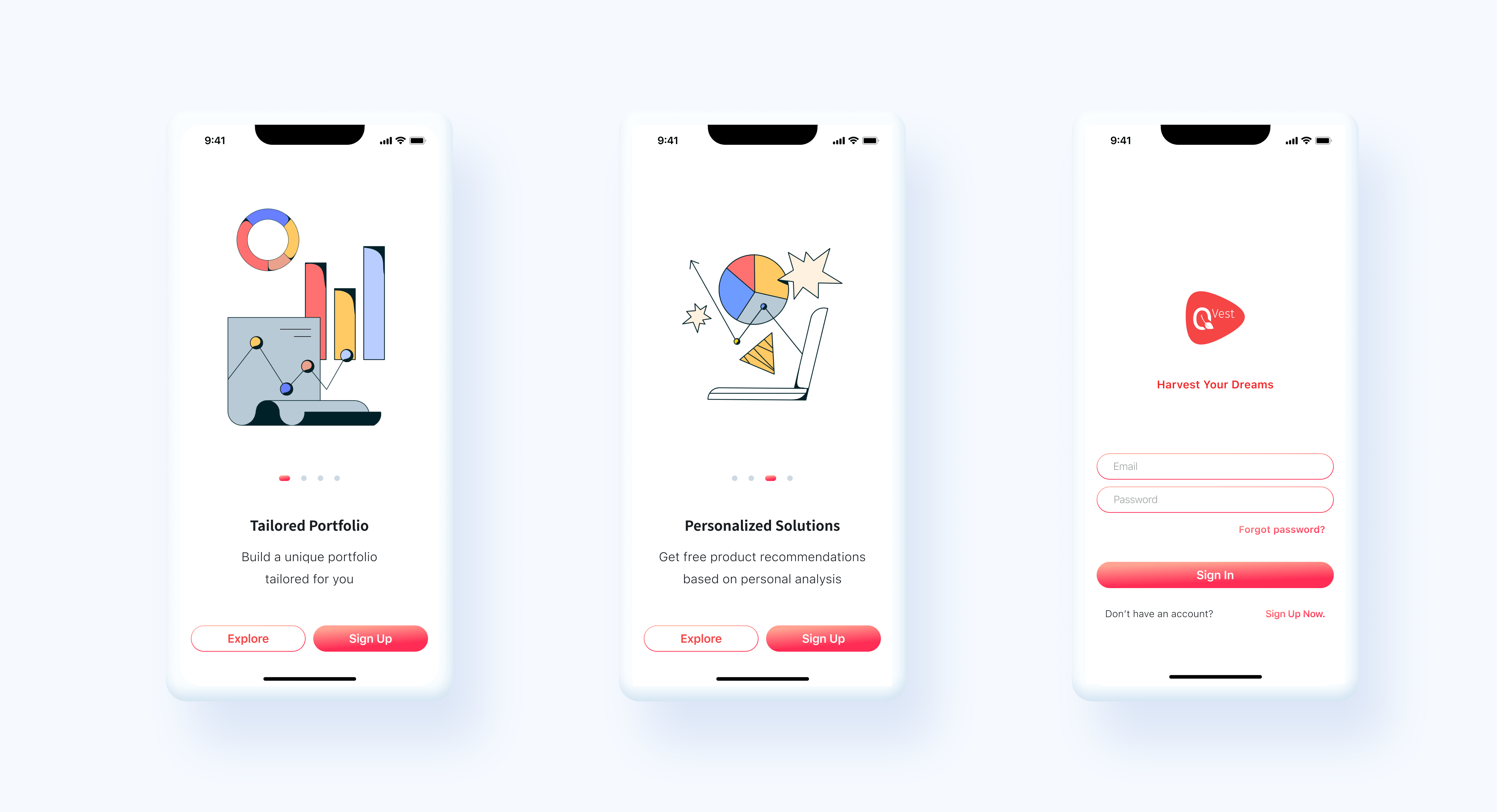
For those who use the app for the first time, the values of the app are presented.
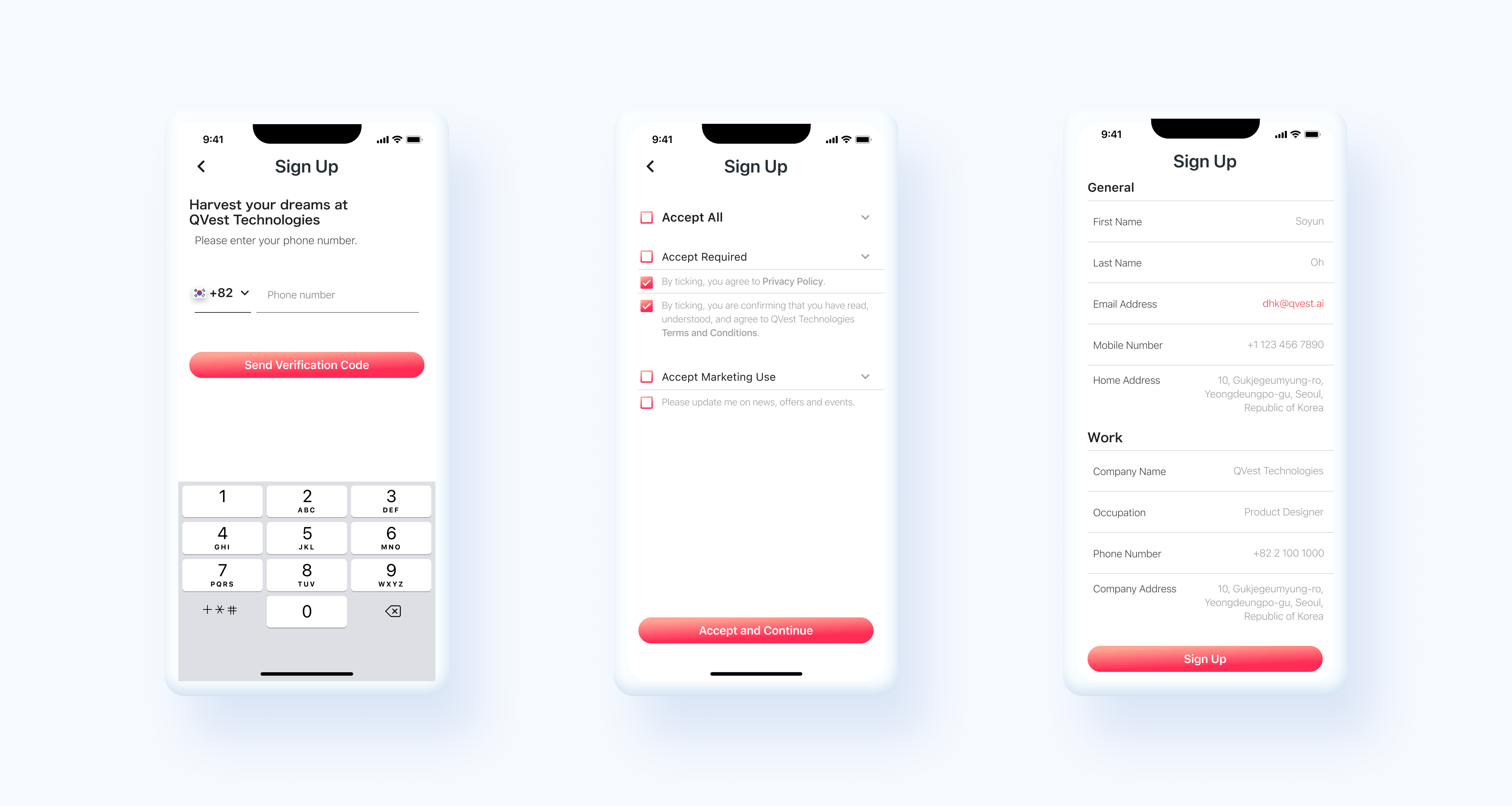
Sign up process has been made simple compared to traditional financial apps that ask for users to go through multiple steps and key in unnecessary personal information.
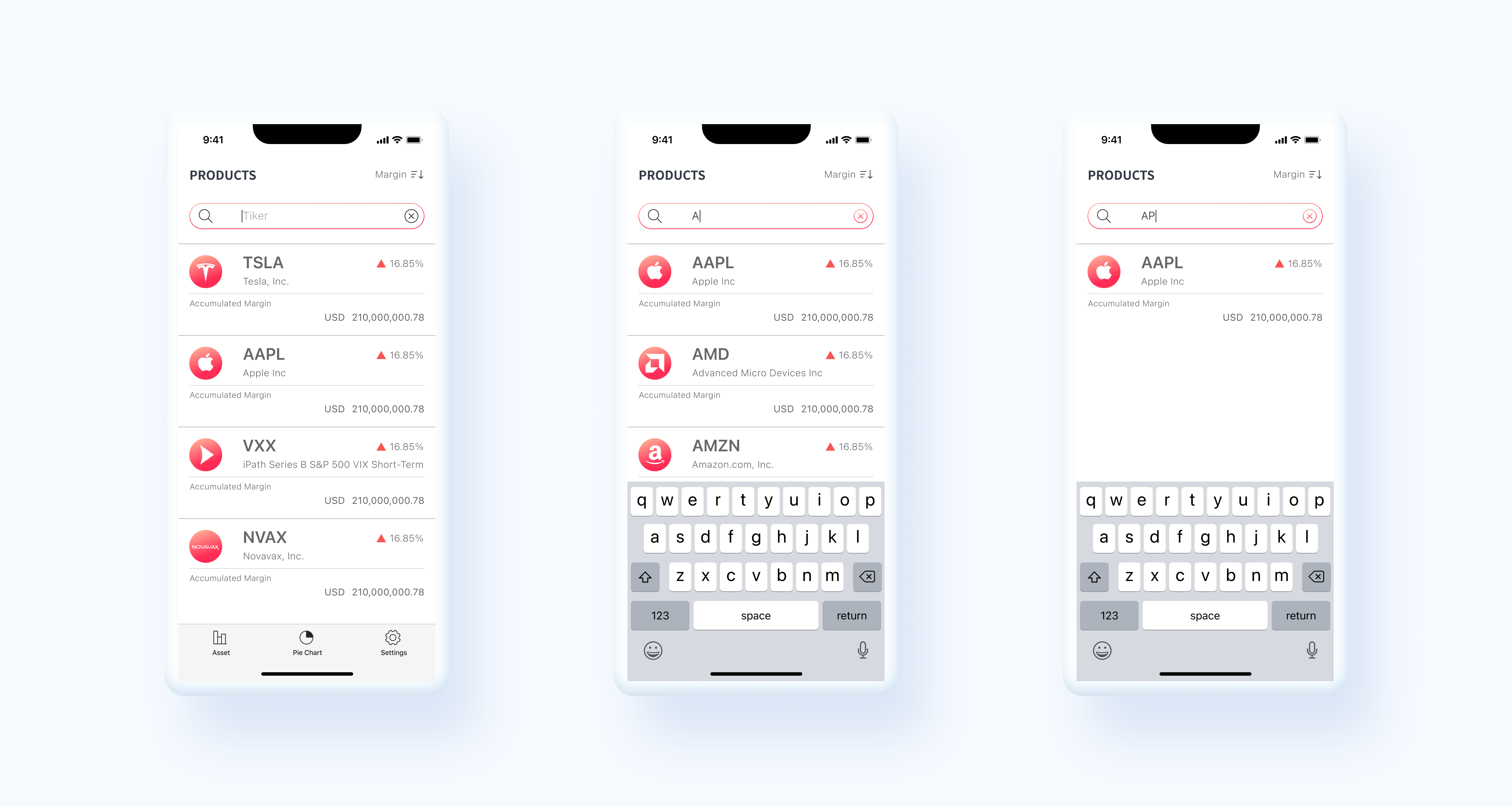
Using the search bar, users can quickly find products by their ticker or company name.

